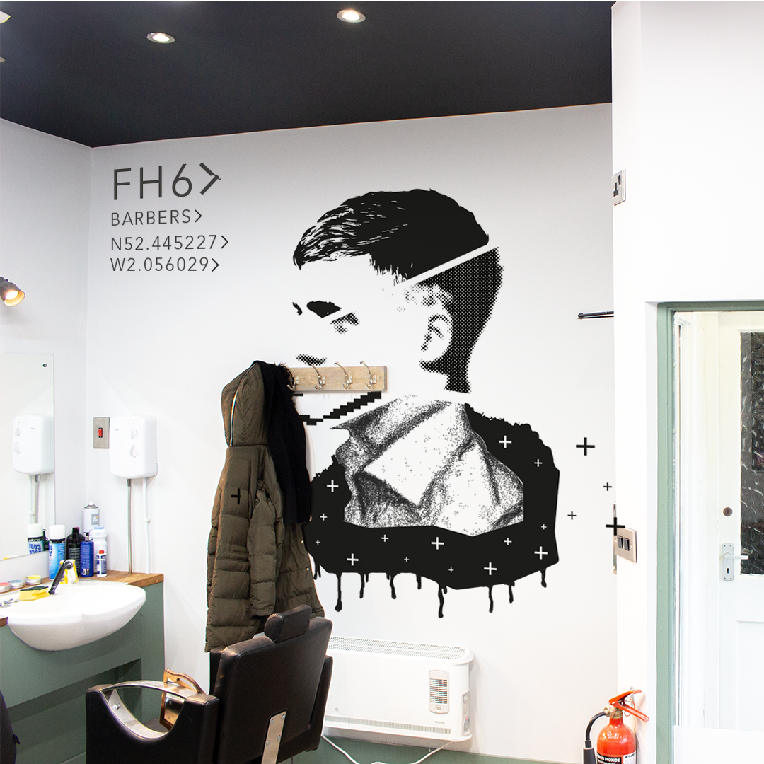
FH6 is a small barber shop that had some generic branding previously and they needed something a little more modern and classier. I chose to use the imagery of a cutthroat as they often used these for certain styles and beard cuts. For the font, a simple modern sans serif font worked best to make the brand look smart and classy.
By creating a detailed image of the cutthroat blade, I was able to produce a responsive logo, on large format signs the full detail image would be used, on print work the silhouette would be used and for an icon or social media image the silhouette would be used without the word mark.
I designed the cutthroat in a way that made it look like a chevron, the symbolism of FH6 being greater than anything else, the arrow pointing forward and the use of chevrons in code presentation as a punctuation mark made it a very versatile shape to use within the branding. I also created a mural to go onto the wall in the barbers that showed their range of ability. The varying styles within the mural linked to the capability of the barbers to do many different styles of haircuts. The use of the chevron was again useful here to include the longitude and latitude of the barbers within the mural.


