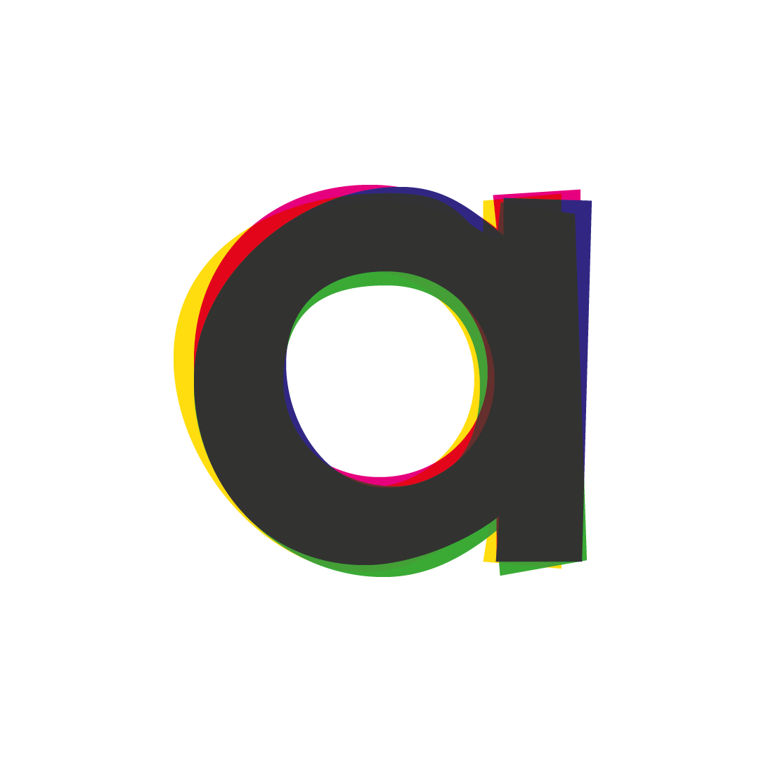
The brief was to design branding for a company who are Leading consultants in urban agriculture and agritecture. They wanted a letterform logo using A, AG or AGT. They wanted it to be simple and modern but show progression and movement whilst alluding to the natural aspect of their work.
Initially I looked at simple shapes and bold colours along with slight distortions to show movement. I then moved on to look at overlapping letter forms and messing with transparency. All the time trying to find the balance between modern design and natural influence.
The final logo consists of lower case ‘a’ and ‘g’. They overlap slightly with the ‘a’ being a modern cyan and magenta split and the ‘g’ being greens and a yellow, the overlap merges the natural and modern with the colours and the transparency allows these colours to merge and transition between one another. The simple abstract structure of the letters has the modern characteristics of the architecture they were looking for whilst using the circles makes it soft enough to not make you think of big construction.


